
Case Study: A Small Business Website Makeover for Douglass Financial Services
“We engaged Laura and Michael to help us revamp and refresh our company website. After meeting with us and getting to know our company & culture, they came up with ideas for a new format and new elements that would be more consistent with our core values and more engaging for clients and prospects. We enjoyed how much they collaborated with us, listening to our ideas while also challenging us to think in new ways when necessary. They helped us envision how our website fit within our overall marketing approach, and developed a website that truly reflects who we are. We couldn’t be more pleased.”
What would a remodel or makeover for your home look like?
If it’s in pretty good shape, maybe a fresh coat of paint in a few rooms is all you need.
Or maybe you’d redo the kitchen—new cabinets, flooring, countertops?
Add on a family room?
Or maybe it needs a lot of work: just take the entire place down to the studs and start over?
Re-doing a small business website can look like any of those scenarios.
For Douglass Financial Services, an independent financial planning business with offices in Pontiac and Bloomington, Illinois, we took the site down to the studs.
The pages on the old site were gray—lots of text. The site needed a visual boost.
More importantly, those pages needed better copywriting.
The Services page, for example, offered little explanation of the good work the company provided. The homepage, after offering a banner photo and a greeting, simply contained the most recent three blog posts.
And the copy throughout the site needed a stronger focus on the visitor and prospective client—more of a “you” perspective than a “we” perspective (a topic you can learn about in our guide).
In short, an effective new website would do a lot of good for this small business.
Homepage Makeover
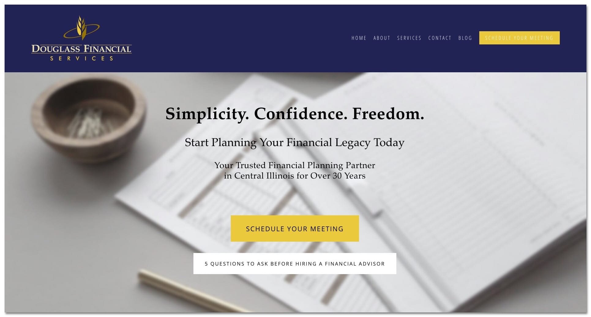
The first screen of content is arguably the most important for your website visitors.
When someone lands on your website, they’ll decide within seconds—or less—whether they’ll stick around. So the content “above the fold” matters a lot. Visually appealing design and effective copy are key here.
Douglass Financial wanted to use their tagline Simplicity. Confidence. Freedom. as the main headline and emphasize establishing a “legacy” in their approach to financial planning.
We also wanted to provide more context for visitors so we added the subhead “Your Trusted Financial Planning Partner in Central Illinois for Over 30 Years.” This additional text locates the business (central Illinois) and helps with search engine optimization (SEO).
Specific calls to action were the final above-the-fold improvement. Besides a Contact link in the main navigation menu, the old homepage offered no call to action. When a visitor shows up at your small business website, you want to invite them to do something.
For Douglass Financial Services, we included two choices: schedule a meeting (the primary CTA) and a downloadable guide (secondary CTA).
The primary CTA identifies visitors who are ready to get started now: yes—I want help!
The secondary CTA gives visitors who aren’t ready for that big first step a chance to do something. In this case, they can download a guide that offers helpful advice. They’re then added to the company’s mailing list so Douglass can continue to build the relationship. At some point later, those prospects may be ready to schedule an appointment and become a client.
The Douglass brothers wrote the content for their guide, 5 Questions to Ask Before Hiring a Financial Advisor, and Laura Myers created the visual design.

The rest of the new homepage follows a model we like to use:
Create tension and interest
Resolve the tension and summarize the business offerings
Provide an overview of the process
And along the way, offer those same CTAs to make it easy for visitors to respond and act.
Old Homepage

New Homepage

Services Page Makeover
The previous Services page on the old Douglass Financial website offered little explanation of the work clients received. It also needed help visually.
For the new page, we asked the Douglass brothers to better explain the services they offered. What was involved, for instance, in “investment advisory services” and “investment management”? They sent us stronger copy which we then revised further so it spoke to the visitor with a “you-focus” (once again, a concept we explain in our guide).
Armed with better product descriptions, we also wrote a new introduction to the page and added both custom photography and a few stock images to enhance the visual appeal of the page.
Old Services Page

New Services Page

About Page Makeover
Your About page is one of the most important pages on your small business website. When done right, it’s a place where you build connection and credibility with your ideal prospects.
Douglass Financial’s old site had an About page and an Our Team page, which we condensed into a single About page.
We kept the team member descriptions mostly “as-is” but added new headshot photography for a consistent, professional look. We also added a new team photo and wrote introductory copy at the top of the page.
Old About Page


New About Page

A Small Business Website Makeover Success
The end result of all this work? Douglass Financial Services came away with two big wins.
First, a much stronger visual presence. The new website gives the company a more professional look, one that easily competes with any other site in their market.
Second, the new website functions as a solid marketing tool. Clear, well-placed calls to action and persuasive, customer-focused copy make the website more than just a showpiece. It can do the work of promoting the business and collecting leads much better than the old website.
Does your small business website need a marketing makeover? Let me know or schedule your free consultation today.
Or if you’re just curious and want to better understand what goes into a great website, please download the FREE 5 Essential Principles of Effective Small Business Websites guide today.
Visit douglassfinancial.com.